With Big Data on the rise we’re all looking for the perfect tool to assist our – ever increasing – Data Visualization & Analysis needs. Are you lost in the ocean of BI options? Trying to find out what’s the right tool for your need?
Then look no further because Gartner just published “Magic Quadrant for Business Intelligence and Analytics Platforms” report and the results look like this…
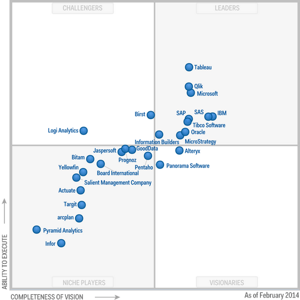
My personal favorite (as I’ve already documented in this blog) and the tool I’m currently using is Tableau (having a quite functional free version doesn’t hurt along with the best UI I’ve ever used). It comes on top as part of the analysis – however that doesn’t cover the complete story since you need the right tool for the right job.
Go ahead and read the full report for a detailed analysis of the pros and cons of the “competitors” and enjoy the BI / Data Visualization journey!
I’d love to hear your experiences (good or bad) and what’s your favorite BI tool!

Worked with cognos, brio and microstrategy, main stream commercial tools but ended with Spago BI and receives my preference. Spago BI, open source, reliable and fully customisable (source code access) to your needs. Of course you need access to Java development skills, else it is perceived as difficult to implement. That is true. The main advantage is that you have fully control over the sources and adapt it completely to your needs and future business needs. for more info see http://www.spagoworld.org/xwiki/bin/view/SpagoBI/
Dario
Pingback: The Big Data playbook | Elias on tech, business and everything else...
Pingback: Getting Big Impact from Big Data… | Elias on tech, business and everything else...